App icons are the faces of applications, and they must be unique to stand out from the competition. Designing an app icon is crucial since it displays the essence of a brand and can drive more downloads. This article provides steps and tips for designing an influential app icon, including do’s and don’ts to consider throughout the process.
Everything You Need to Know About App Icons
Understanding the design of app icons is an essential step before getting started. An application icon is a small design element representing your app in any app store, on the home screen, when receiving a notification, or within the settings section.
These badges can be based on your brand logo or some other captivating visuals that reflect and communicate your brand’s theme. The primary purpose of an app icon is to help identify the app or brand and further promote it in marketing.
Some Designs Standards for App Icons
The application icon should be crafted to entice users to take action. Although it is small, the app icon communicates the essence of the application’s purpose. Like making a good first impression, an effective app icon design is essential for successful marketing. Here are some key tips to ensure your icon meets all the criteria of a great marketing tool.
App icon scalability
There are many occasions in which we may come across application icons without realizing them, such as app stores, home screens, settings menus, search results, lock screens, and more. To make sure the icon is visible and recognizable in all of these cases, it is essential to have an eye-catching design that will not be overshadowed by other elements or crowded out.
On the other hand, it must also maintain its quality when enlarged, as it would be on larger displays like tablet/iPad screens, laptops, or TVs. Using too many small components in an icon may impede scalability and cause strain to the viewer’s eyes if seen at a smaller size; once it is increased, these elements tend to be the first ones to become pixelated.
Another critical aspect is that most users have already enabled ‘Dark Mode’ following its release. Ensure that your app icon stands out and is visible on all backgrounds, including in dark mode. Aim to create timeless designs so they stay in fashion quickly. Avoid incorporating trends or flamboyant elements when making updates, and you’ll need to tweak and modify the color scheme. Changing the core elements of your app icon could lead to a decrease in download rate.
Easily recognizable icon design
The recognizability of a mobile app icon is its most essential characteristic. Consequently, you should select colors, shapes, fonts, and visuals that will remain consistent. Avoid making the design too basic or generic – people are more likely to remember something that catches their eye! Visualize your ideal consumer persona and consider the app’s features and primary functions.
Remember to include your brand color palette in the design process as well. Creating an attention-grabbing element will help make your icon memorable and recognizable for returning users.
Maintain brand consistency within the icon
Begin by considering the number of existing applications related to your area of interest and the design style they have adopted. You can find great examples of how these apps present their features visually – those should be considered when creating your icon. This process can become complex if it is attempted without a plan.
Start by jotting down each app function in one-word terms. Come up with visuals to represent each word, ensuring that the primary functions are included, not just the secondary ones. Then try combining these visual elements into one icon – this could result in several different designs—experiment by playing around with these essential components until you have a design that reflects your brand.
Take your time when designing, and feel free to create a design based on current trends. The design must feature essential elements which represent your brand. The application’s icon’s appearance should match the app’s user experience and vice versa.
Ideal icon size and format
As discussed before, it is essential to have a design that looks great on all sizes of app icons. This eliminates the need to create multiple designs for each size, as a single one can adapt to all sizes without compromising its appearance. The most common sizes for Android devices are 96,✕96, 72,✕72, 48,✕48, and 36✕36 pixels; however, the recommended size is 864✕864 pixels for better scalability. For iPhones, a standard size of 1024✕1024 pixels is suggested for application icons. The icon’s size may be adjusted depending on the device being used.
The design of application icons must be in PNG format for both Android and iOS platforms. JPG/JPEG or any other formats are not compatible. Therefore, it is essential to use software or online tools that can output the icons in PNG format.
Steps for Design Prep
Research the existing designs in the market
Before beginning the designing process, it is essential to be aware that there are nearly two million apps on the Apple App Store and over 2.8 million apps on the Google Play Store.
Analyze what other popular applications look like in your niche and pay attention to their app icons – noting which elements you like or dislike and the colors that reflect their app’s aesthetics. All these considerations should be done keeping in mind the user persona of your application. This step is crucial and should be addressed.
Now you have a clear path ahead of you, start designing with freedom. Don’t worry about having the final product yet. Keep experimenting and altering the design according to your preferences but make sure there is a purposeful reason behind each choice. Make a note of what works and what doesn’t so you can create a list of Dos and Don’ts tailored to your brand and business. This will help you create the perfect design for your project.
Keep app store recommendations in check
The following step is to ensure that your app can be downloaded from all relevant app stores. This is when the user and application icon interface comes into play initially. You have full liberty to apply your creativity in designing the app icon as it suits you or your brand, yet abide by the guidelines of both Android and iOS app stores. Google Play Store and Apple App Store have created specific instructions for sizing, color scheme, fonts, type, and testing; these rules guarantee that you take the time to include design elements that are advantageous for your app marketing. If your app icon’s design follows those regulations, your app will likely appear on the top search results.
Pick a flexible software design tool
It is best to consult a design expert or friend if you are still determining which design software to use for your app icon. If there is an option to export the design in PNG format, test the software first with a sample so you don’t spend hours creating something that cannot be saved correctly.
A few software tools, such as Adobe Photoshop and Illustrator, require some familiarity when designing an app icon. However, more straightforward drag-and-drop programs are available with an intuitive UI that doesn’t necessitate professional skills. Check if they allow PNG format export in their free version, or choose the paid version if you prefer.
If you have someone skilled in design, you can ask them to help create the icon or draw up some ideas yourself and provide it as inspiration. Don’t let a lack of software knowledge limit your creativity – take the time to learn an online drag-and-drop tool and start designing your icon.
App Icon Design Essentials
This section isn’t a step in the design process but rather a list of important reminders. App icon design can be complex and overwhelming for designers to develop creative ideas. Therefore it is essential to take notes and brainstorm during the process. The following key points will help ensure that your design journey runs smoothly.
Avoid cramming too many design elements
The utmost detriment that a cluttered app icon design can cause is the transmission of a wrong message about the app’s purpose. Too many design elements can relay multiple messages or muddle the actual message in the process. If you take anything away from designing an app icon, it should be to make sure your brand’s message is unmistakable. Elements can be added to support the message without making it too visually overwhelming.
The size of app icons should be kept small, as cramming too many elements into it will make them lose their professional appeal and prove pointless. To understand how much to include in the design, try visualizing the icon at its smallest possible size – for example, inside a notification panel. The parts that remain clear even in this size should be retained, and the rest needs to be discarded.
If you feel that such a step will significantly alter your design, it is a sign that you have failed to communicate your brand’s message effectively. Once you are done with making the necessary changes, you will have a better understanding of what modifications need to be incorporated into the icon.
Opt for a wise color scheme
Selecting the color scheme for your app icon should consider a few critical elements. If you have an existing brand or logo associated with your app, ensure that your icon’s colors, fonts, and shapes perfectly match it. Otherwise, consider using vibrant colors or white to make the design stand out even in dark mode; this should also be in sync with the UI/UX design of the app screens. Test your icon on different wallpapers, as these will affect its visibility.
This way, you can ensure that your app icon can capture users’ attention regardless of their background settings. Colors possess the power to evoke certain emotions and memories and so, when used cleverly, can give your app icon a unique appeal.
If you’re starting with a fresh canvas, there are examples of choosing your color palette. For example, if the app is related to food or delivery, an orange or red color scheme can be used as they usually symbolize edibles. Restaurants may adopt the same color psychology and shades will depend on the design. An app related to budgeting or money management can feature greens, olives, and blues contrasting with yellow and gold.
Greens remind us of dollar bills, while gold is symbolic of coins. For games or apps related to women’s fashion, a pastel color scheme should be used with darker colors for contrast, such as red. A good rule of thumb when using multiple colors is to ensure the contrast is clear.
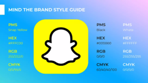
Stay aligned with the brand style guide
Creating the app icon is an essential part of the app development process. As the logo represents a brand’s online presence, building the app icon in conjunction with the rest of this identity is essential. Be sure to start before the development process is complete but instead make sure you align with your brand style guide from the outset.
Stick to your brand’s design with an established color palette, theme, and overall vibe. No matter what type of icon you pick – whether character-based, logo-based, function-based, or features-based – it is paramount to accurately and clearly convey your brand message. Incorrect, foggy, and multiple messages of your brand’s vision will be disastrous.
For example, if your app specializes in designing and offering home decor products, then using an overly animated app icon or any dynamic characters could give off the impression that this is a game for decor design. This could lead to potential customers scrolling past your store without reading the description, which would severely impact business and revenue.
You may draw in an audience unsuitable for your product, such as those looking for a game. Therefore it is crucial to ensure that the icon accurately represents your brand.
Using words is a bad idea
Words are too small to be read on a tiny application icon and cannot make sense, so there is no point in adding words. Even if your brand logo is based on words, the app store’s guidelines do not recommend it. Popular apps like Facebook and Instagram have relevant icons to their theme but need to include the complete word. Keeping the icons consistent demonstrates professionalism and adds to the overall credibility.
For example, Instagram has apps like a collage maker and these have similar app icon themes and color schemes. While using the full brand name might not be ideal, you can consider shortening it with initials but make sure to include at most three letters, as that will overcrowd the app. Your mobile application icon should be visible from the notification panel; adding words will not achieve this. Words are difficult to read in such a small space, making your app icon look unprofessional.
Make sure to settle for a photo icon
Using a photo for the app icon is not recommended. There is nothing attractive about having a random image as your mobile application icon, and although it may save time in designing an actual icon, it’s not worth it. Getting the perfect picture that looks professional can be challenging because it could quickly become pixelated.
App icons should be easily scalable, so it is not advisable to use pictures for this purpose. Poorly pixelated images inside the app icon can make your app appear fake and thus help other similar apps stand out. App icons with photos usually go unnoticed, which affects their download rate and overall business performance.
Don’t shy away from bold and distinctive icon design
The objective of icon design is to attract viewers and entice them to click on the app icon, read its description, and download it. This can be daunting as numerous regulations governing app icon designs can easily stifle creativity. Remember that this is your brand and app, so start with a blank slate by designing multiple variations.
Brainstorm and write down the purpose of each element. Then examine which designs are within the app store’s guidelines. Get a second opinion from a designer friend or family member to see which icon design is best.
Feel free to add unique shapes
The best way to guarantee an eye-catching app icon is to add unique shapes. If you are creative enough, you can take advantage of doodling and sketch around your brand initials to correspond with the color scheme. Adding abstract forms is a great way to make the design stand out and be memorable. Various shades, tones, and contrasting elements can make the icons more dynamic.
Start by drawing on paper and creating shapes that look visually appealing. Then, incorporate your brand or app name initials to see if that works for you. Although using initials may be limited due to the number of ways they can be doodled, creative use of color and typography can create a range of unique icons.
QUESTIONS AND ANSWERS
Q1: What should be kept in mind while creating an app icon?
A: When designing an app icon, it is essential to make it visible even on small sizes in various UIs such as mobile application stores, home screens, lock screens, and notification bars.
Q2: Why is it not recommended to use photos for app icons?
A: Photos are not recommended for app icons because they can quickly become pixelated and may make the app appear fake or outdated.
Q3: What should be avoided when creating an app icon?
A: When creating an app icon, it is best to avoid using photos as they can quickly become pixelated and make the app appear fake.
Q4: How many letters should an app icon have?
A: App icons do not need to be limited to a certain number of letters, but using initials as part of the design can help create unique and memorable icons.
Q5: What are some tips for designing an eye-catching app icon?
A: Some tips for creating an eye-catching app icon include utilizing vibrant colors that stand out even on dark backgrounds, adding abstract forms and shapes to make the design stand out, and incorporating brand or app name initials. Additionally, getting a second opinion from a designer friend or family member can help to determine which icon design is best.
CONCLUSION
Designing app icons visible from reduced sizes in various UIs like mobile application stores, home screens, lock screens, and notification bars are essential. While doing so, one should keep their target audience in mind and create designs that communicate the brand’s message. Vibrant colors which stand out even on dark backgrounds should be used, and trendy designs should be avoided as they can become outdated quickly. Moreover, guidelines of the platform where the app will be uploaded should be considered when creating multiple samples. Finally, adding a bit of character to the design could maximize downloads.